That Science Lady
PRIMARY SCIENCE BRAND IDENTITY
Client: That Science lady – A Leeds based primary science consultant and Award winning author, delivering CPD and resources on all things primary science.
Product: Delivering CPD, Science Resources and Corporate sponsored learning in Primary schools.
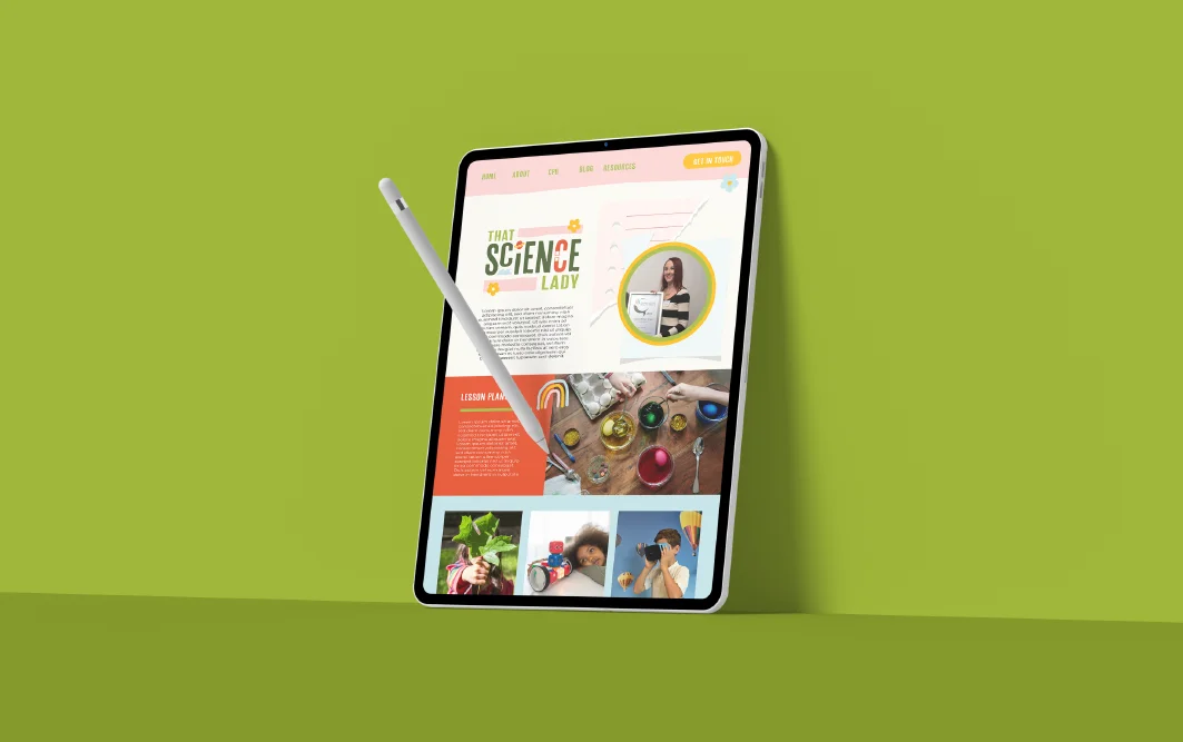
Style: Bold, quirky, playful and fun – with a scrappy and rough edge – appeals to teachers and corporates whilst keeping kids at the heart.
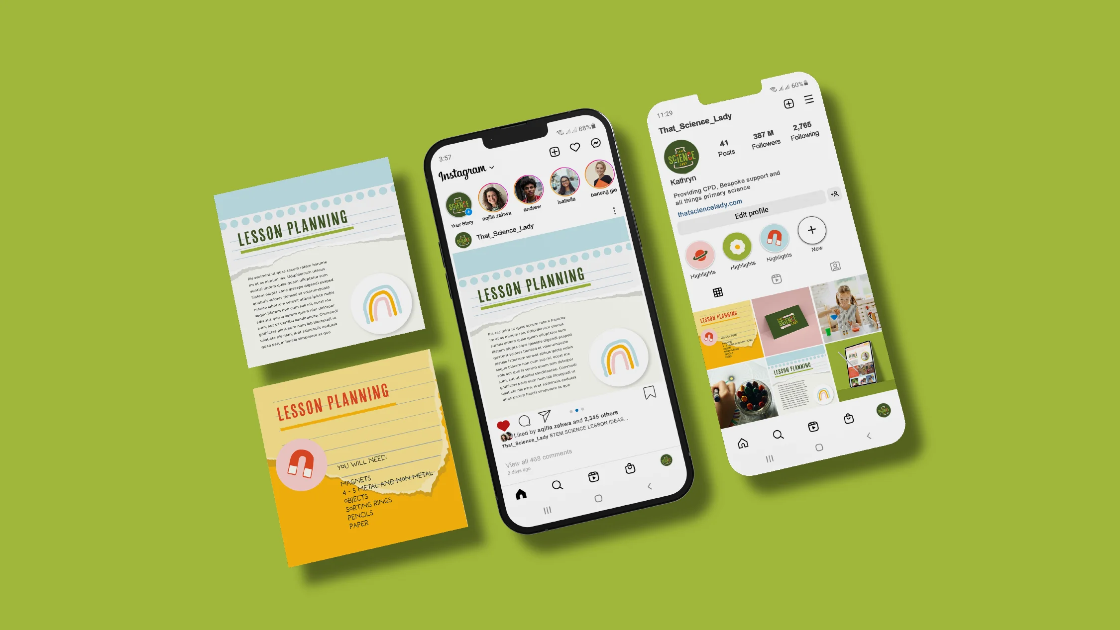
Features: Brand identity – Logo suite, colours, typography and comprehensive brand gyidelines with layout styles for social media and web design.
Revamping a Primary Science Brand Identity
So, picture this: ‘That Science Lady’, a former primary school teacher and author, decided it was time to shake things up in the world of primary science education. Not just your bog standard science brand with lab coats and bunsen burners – she wanted to do something different, be a little bolder?
But here’s the twist – she needed to appeal to two different crowds: Science leads in primary schools and those corporate types to sponsor her, all while keeping the kiddos at the heart of it. Quite the challenge, right?
Objective: Our mission? To give ‘That Science Lady’ a brand makeover that would make her stand out to primary school science leaders, corporates, and, of course, the little scientists themselves. We wanted to inject some pizzazz into her brand without going too overboard on the childish stuff.

Approach
Discovery Phase: We spoke a lot to founder Kathryn about her audience – and her classroom experience. One key bit of info we leaned into is that science teachers tend to perform experiments in a slightly ‘scrappy way’ due to budget constraints. We wanted to convey that scrappiness in a really fun and quirky way.
Brand Strategy: We needed to lean fully on the existing science curriculum so a little research was needed in this department – its a long time since we were in school! The strategy to get to the teachers and corporates was to present them with familiar themes and show real understanding of the world in which they operate.
We knew that the brand essentially had to be fun, playful and characterful and it obviously needed to stand out from many others in the field. We looked at similar brands and businesses with the same audience and some of the same problems; such as ‘the life centre in Newcastle’ – which appealed to both kids and serious science researchers and ‘Oxford owl’ a favourite site amongst teachers for primary resources.
Visual Brand Overhaul
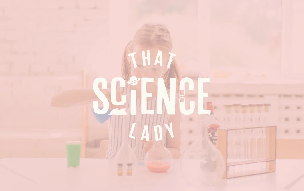
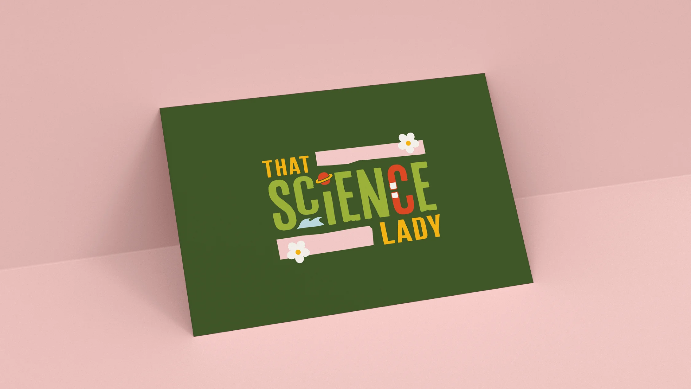
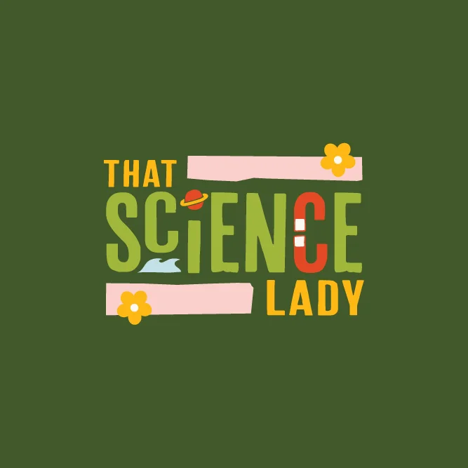
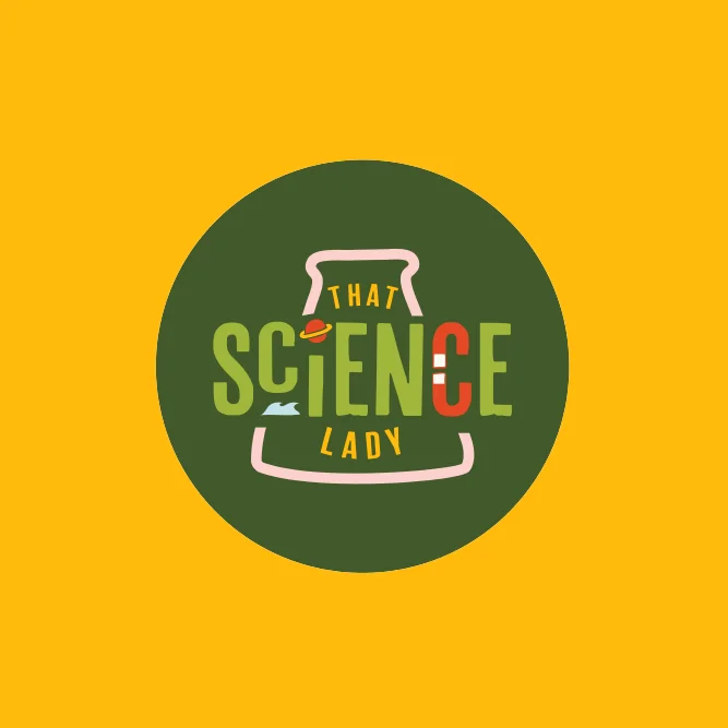
Logo Suite: Armed with a bag full of research and a head full of ideas, we cooked up a batch of logos with bold colours and characterful type – think vibrant greens, punchy yellows, sassy reds, and a hint of pastel pink. They were fun, quirky, and definitely got the message across.
We incorporated 4 key themes into the logo that are easily recognised as key subjects in the science curriculum – the water cycle, forces, space and nature.
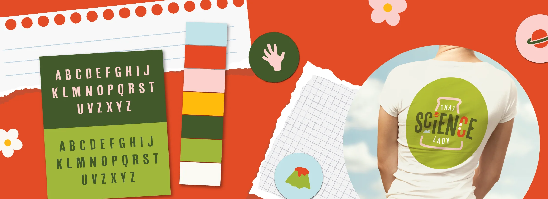
Color Palette: We picked out a bunch of colours that would make you sit up and take notice. Natural greens were our base, but we threw in some zesty secondary colours for good measure.
Typography: We went for a rough edged chunky text and incorporated illustration for the logo – this bold type would be mirrored in headers on social media and the website – along with a clear and simple sans serif for body text.
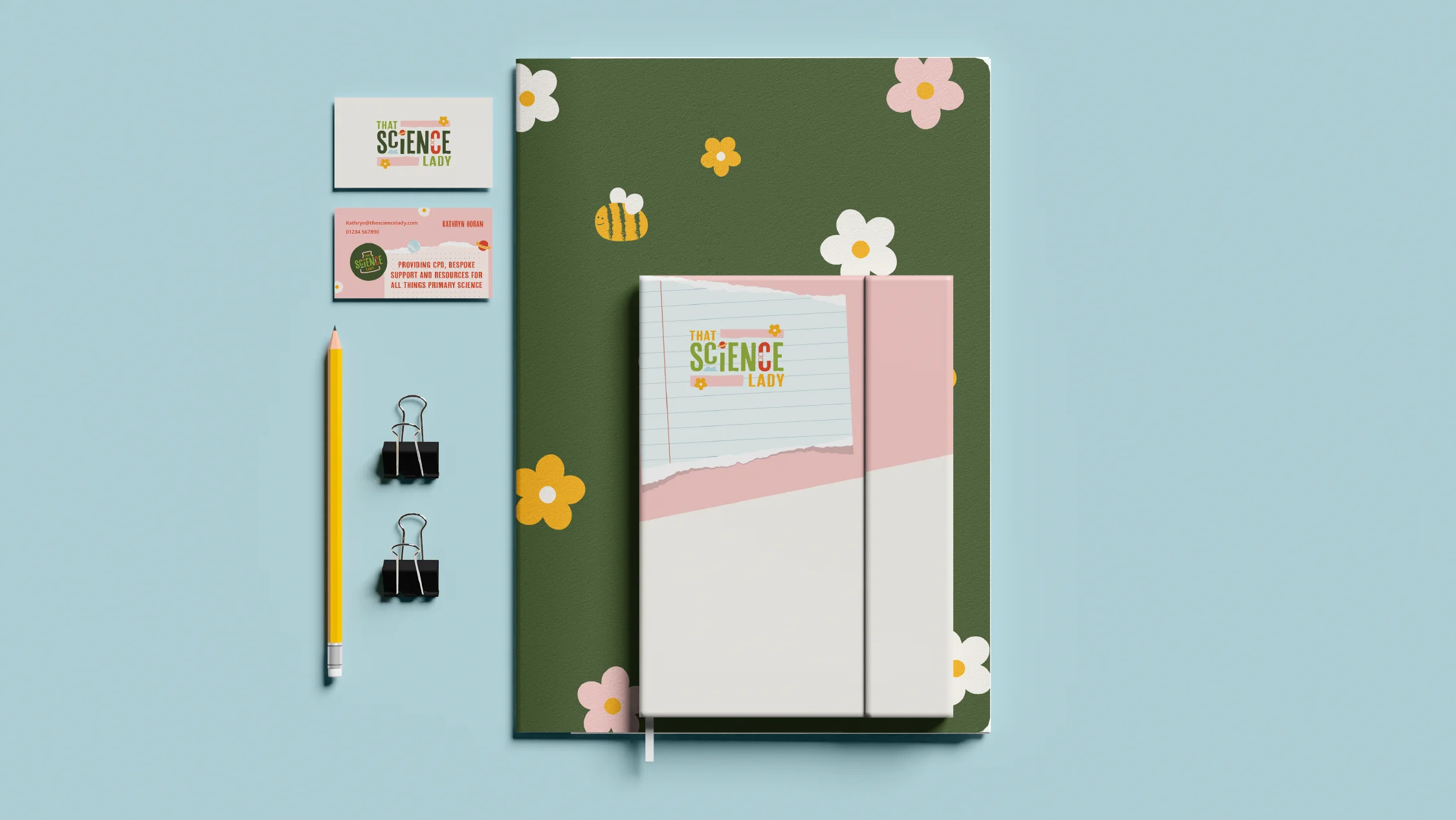
Comprehensive Brand Guidelines: We put together a handy guide that laid out how to use the logos, which colours to use where, and even gave some tips on how to sound like ‘That Science Lady’ on social media.
Within the brand presentation we also included some example layouts for social posts and even a wireframe design for her website homepage – something that would be easy to navigate and packed full of personality.
Outcome
And voilà! ‘That Science Lady’ emerged from her makeover looking fresh and fabulous. Her new look caught the eye of primary school science leads, corporate suits, and even the kids themselves. It was clear that learning science could be a blast, and ‘That Science Lady’ was leading the charge.
With our help, she’d nailed the tricky task of appealing to multiple audiences while staying true to her roots. She was on track to become the go-to guru for primary science education, inspiring a whole generation of budding scientists along the way.