
The Ladies Working Dog Group
Brand strategy & Identity
Client: The Ladies working Dog Group
Style: Notalgic, traditional, feminine and a little bit scrappy (in a good way.) Promoting progress over perfection.
Features: Brand Strategy, Brand Identity, Dog training logo suite, Illustrations, Planner design, Ad design, Visual brand overhaul.
Dog Trainer Branding for a Community Built Around Dogs
When Joanne Perrott first told me about the Ladies Working Dog Group, it was clear straight away that this wasn’t just another dog training brand that needed a bog-standard ‘dog training logo’
Yes, there’s training involved. And yes, there are working dogs. But at its heart LWDG is a community for women who share a deep love of dogs and the countryside.
Some members work their dogs on estates and come from traditional gundog backgrounds. Others have ended up with what the LWDG like to call “an accidental working dog.” Often a spaniel from a working line with more energy and instinct than the average household pet.
Two very different backgrounds. One shared reality.
Standing out in a field with your dog, trying your best to figure things out together.
No screens. No noise. Just you, your dog and the outdoors.
That feeling became the visual anchor for this brand.

The Working dog world
The working dog world can feel quite traditional. Sometimes intimidating if you’re new to it. At the same time, many dog training brands speak purely to pet owners.
LWDG sits somewhere in the middle.
Joanne has created a space where experienced handlers and newer dog owners can learn together. Where asking questions is encouraged. Where mistakes are normal. Where women support each other rather than compete.
The branding needed to reflect that.
It had to respect countryside traditions without feeling too tied to the gundog industry. It also had to feel welcoming to women who might simply be trying to channel the energy of a lively spaniel.
Most importantly, it had to feel real.
Finding the common ground
When audiences come from different backgrounds, the trick is finding what connects them.
In this case it wasn’t experience levels or training styles.
It was the moment people share with their dogs outside.
That quiet moment in nature when everything else fades away.
That feeling runs through the whole visual identity.
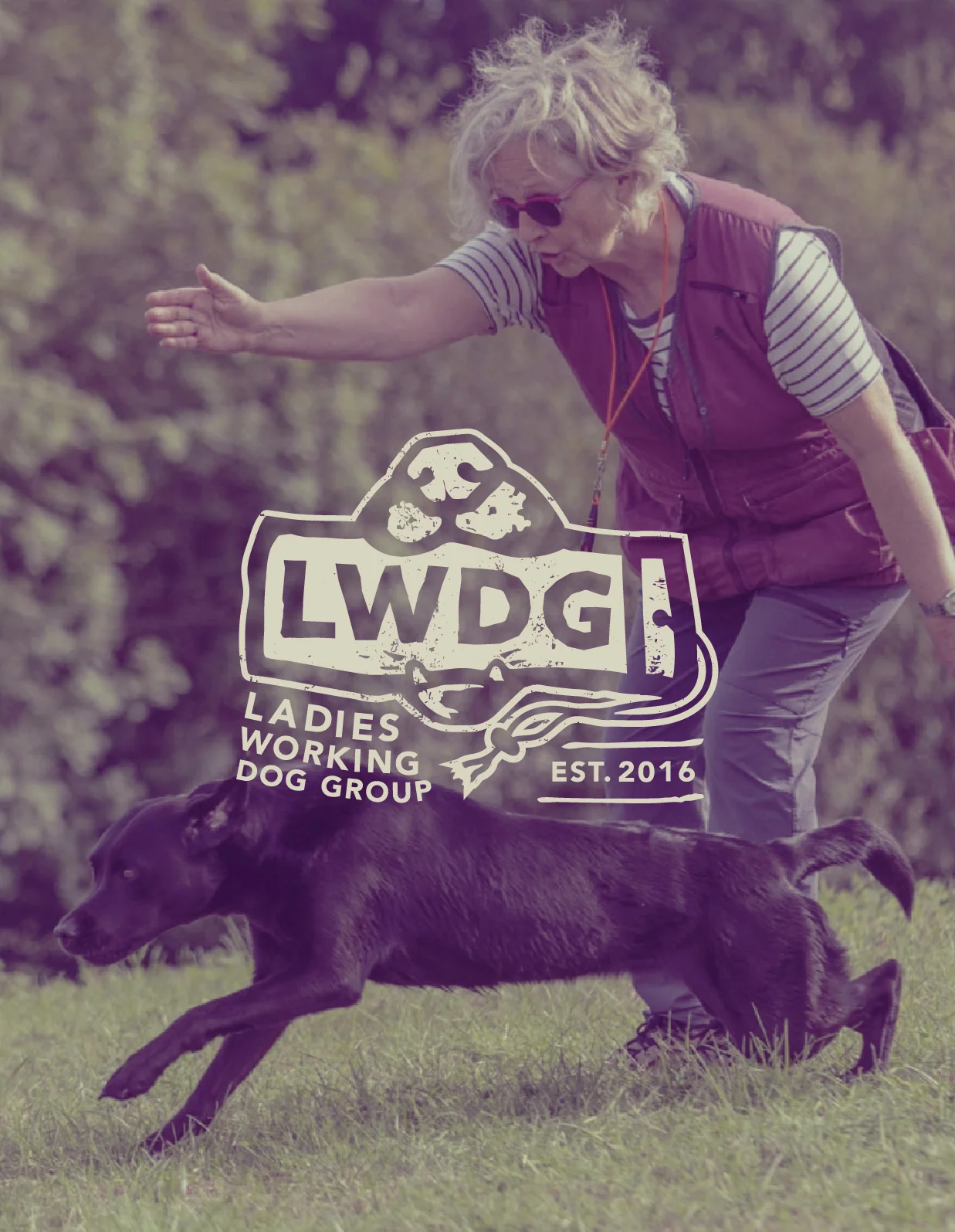
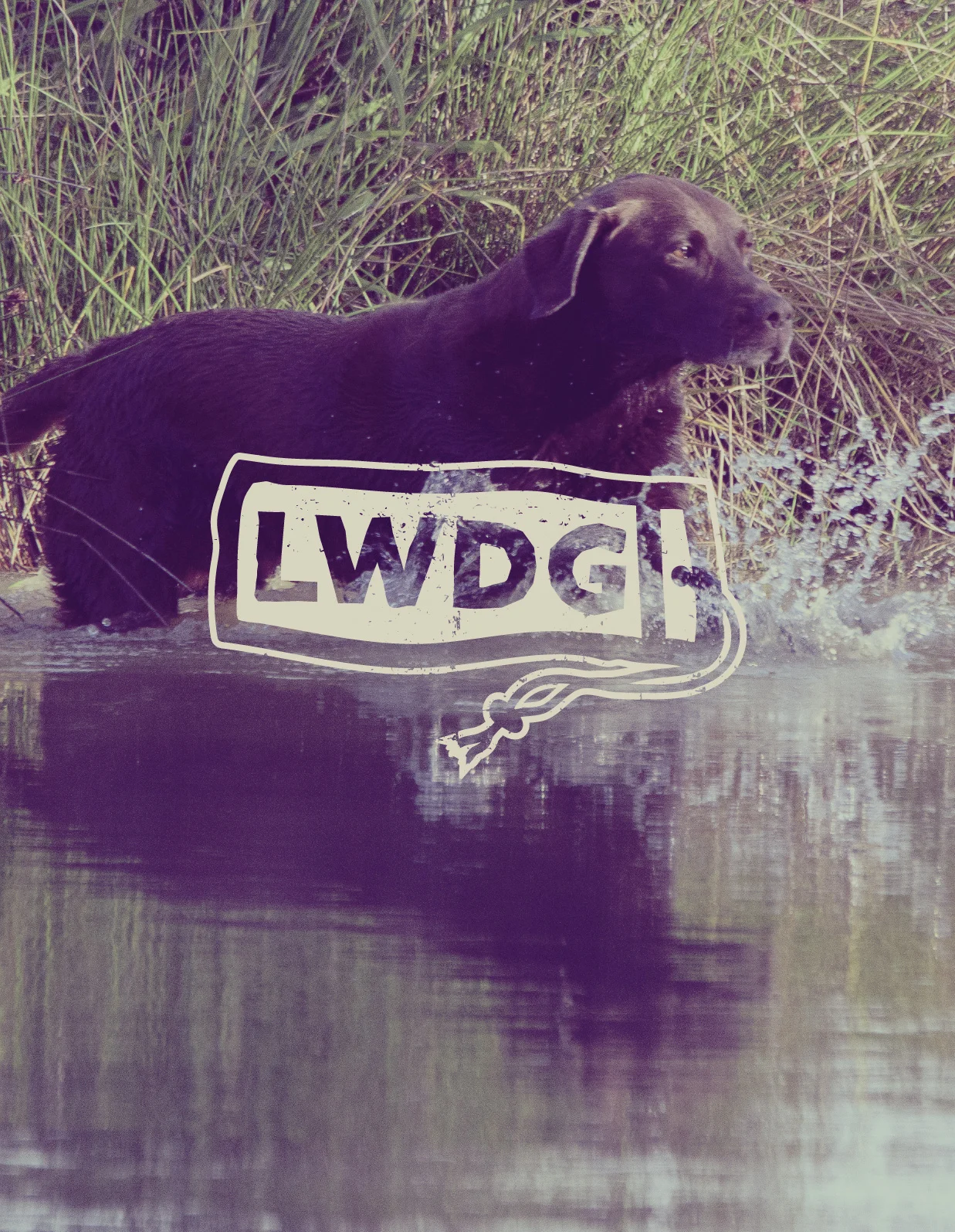
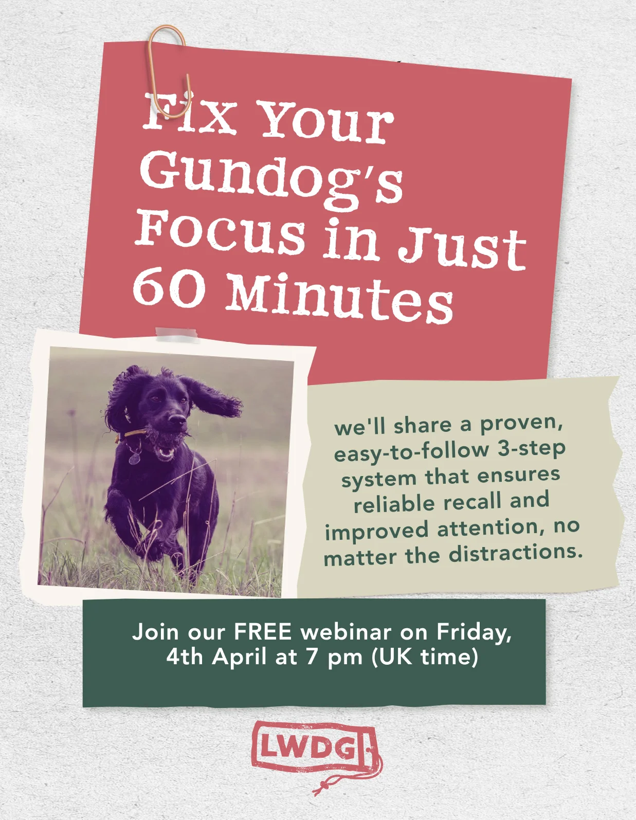
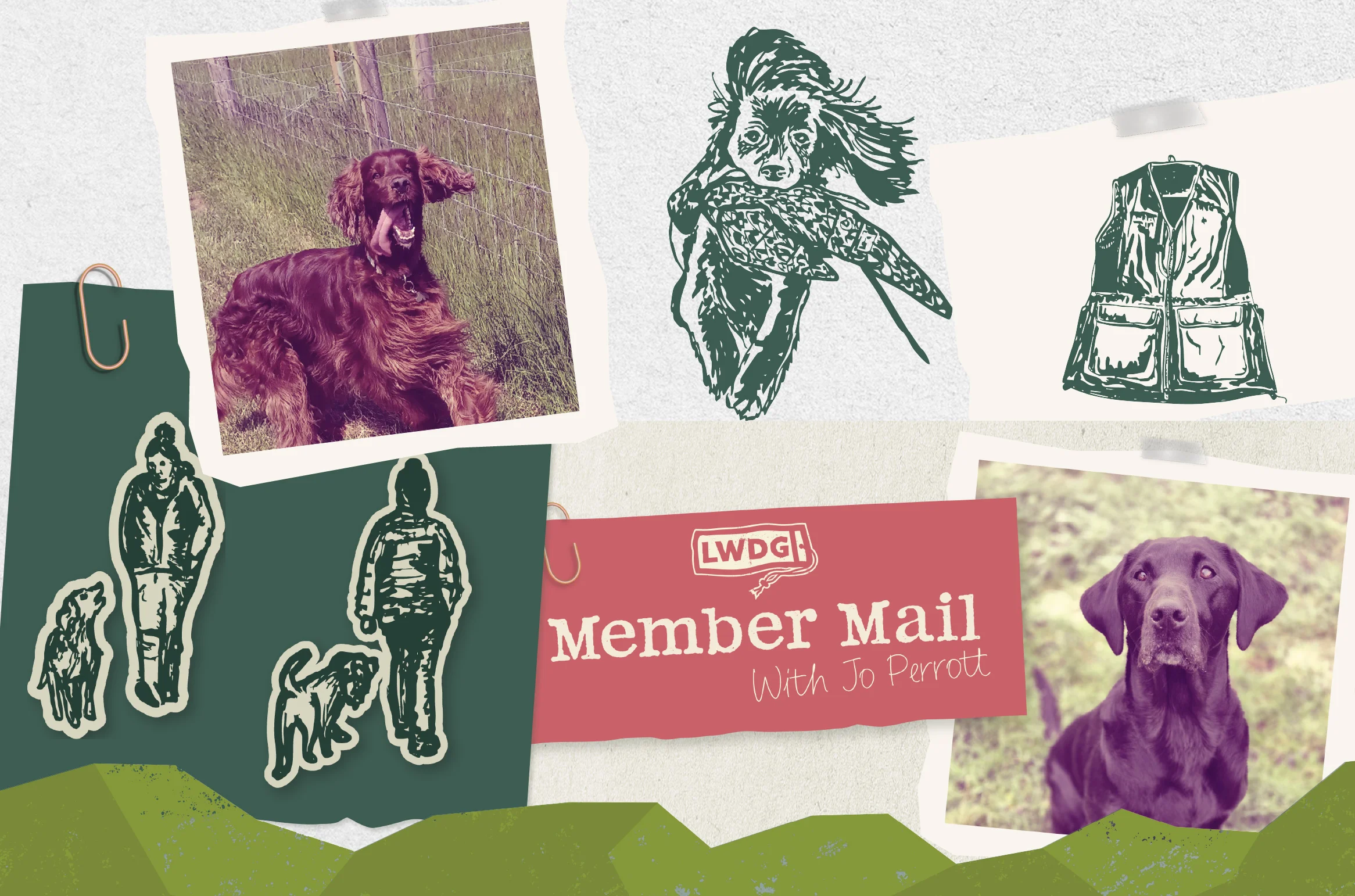
Filtered field photography, natural colours and rustic textures create a sense of nostalgia. Almost like stepping away from modern life for a while and going back to something simpler.
Embracing the “Hot Mess Handler” vibe
One of the things I loved most about this project was Joanne’s training philosophy.
Her course is called the Hot Mess Handler.
Which, if you’ve ever tried to train a high-drive dog, will probably feel very familiar.
Rather than focusing on polished perfection, the programme encourages women to try things, learn as they go and share the journey together. Progress matters far more than perfection.
We wanted the visual identity to reflect that attitude.
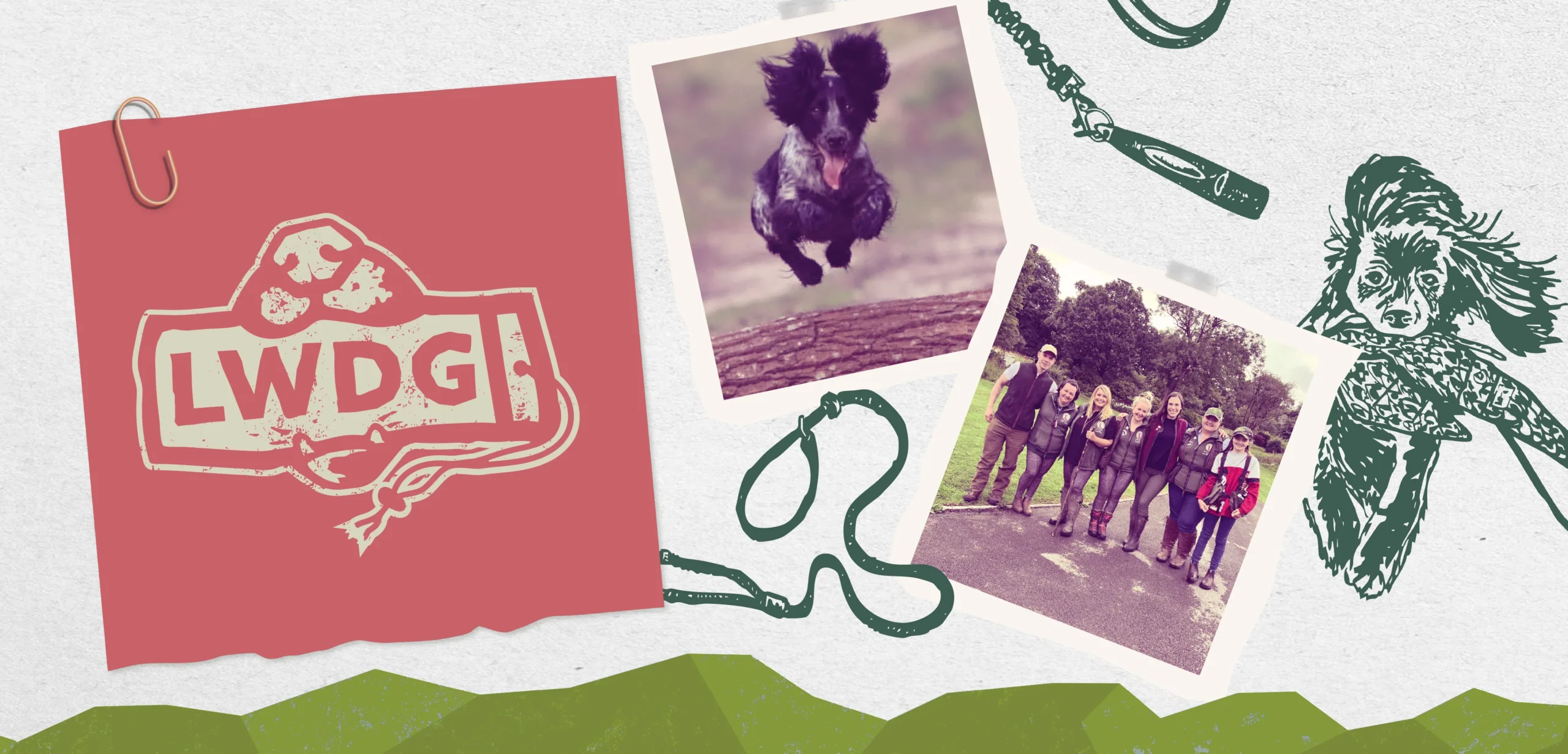
That’s where the scrappy layered styling came in. Notes pinned to boards. Rough edges. Overlaid images. Elements that feel a little imperfect and human.
Because dog training rarely looks tidy in real life.
And that’s completely fine.
More than a dog training logo
The project did include a dog training logo, but it was never just about creating a logo.
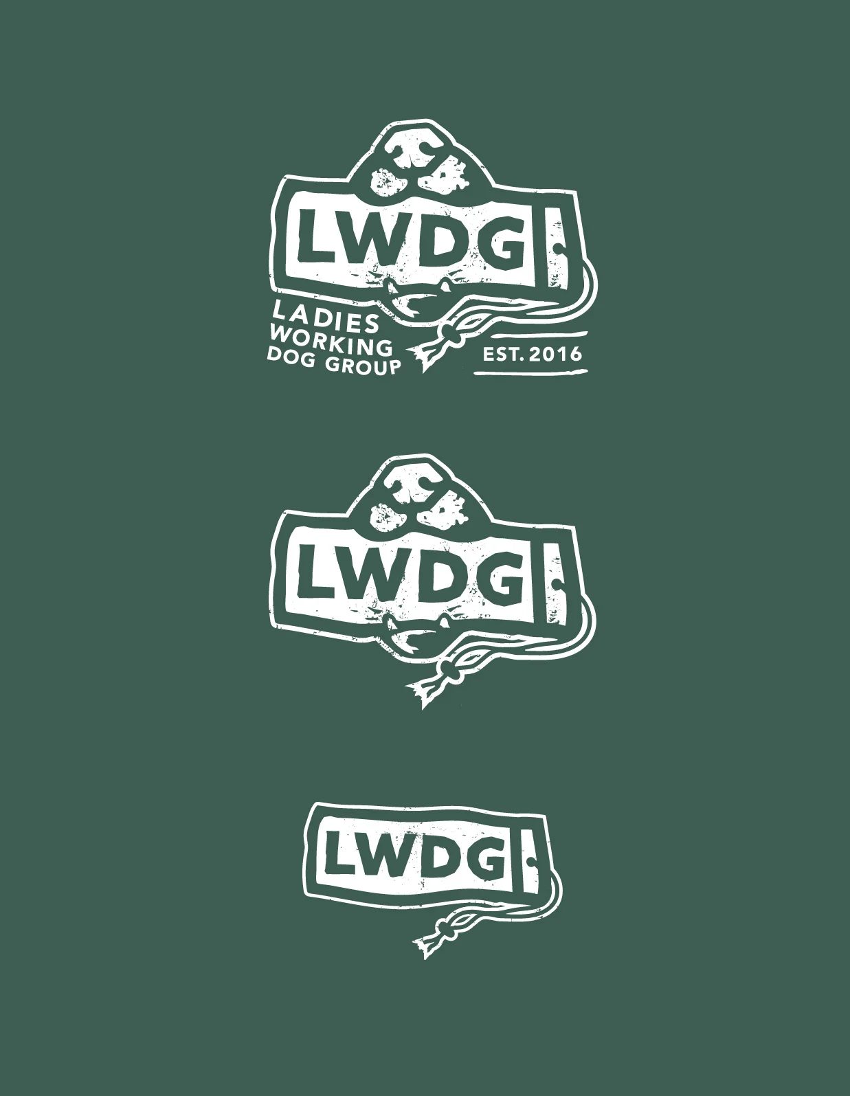
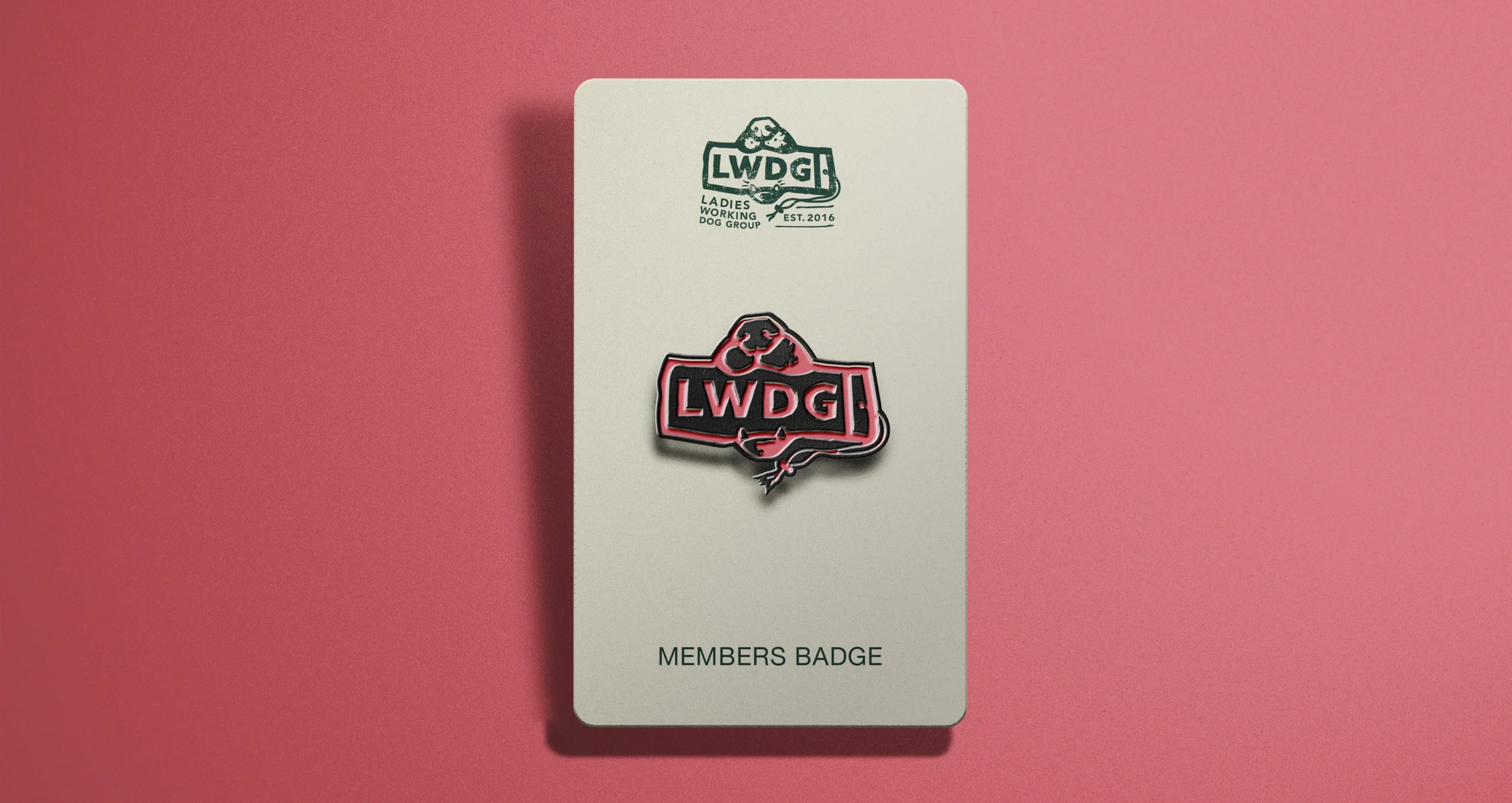
The mark itself takes inspiration from heritage countryside badges. Something that feels rooted in rural life but still friendly and approachable.
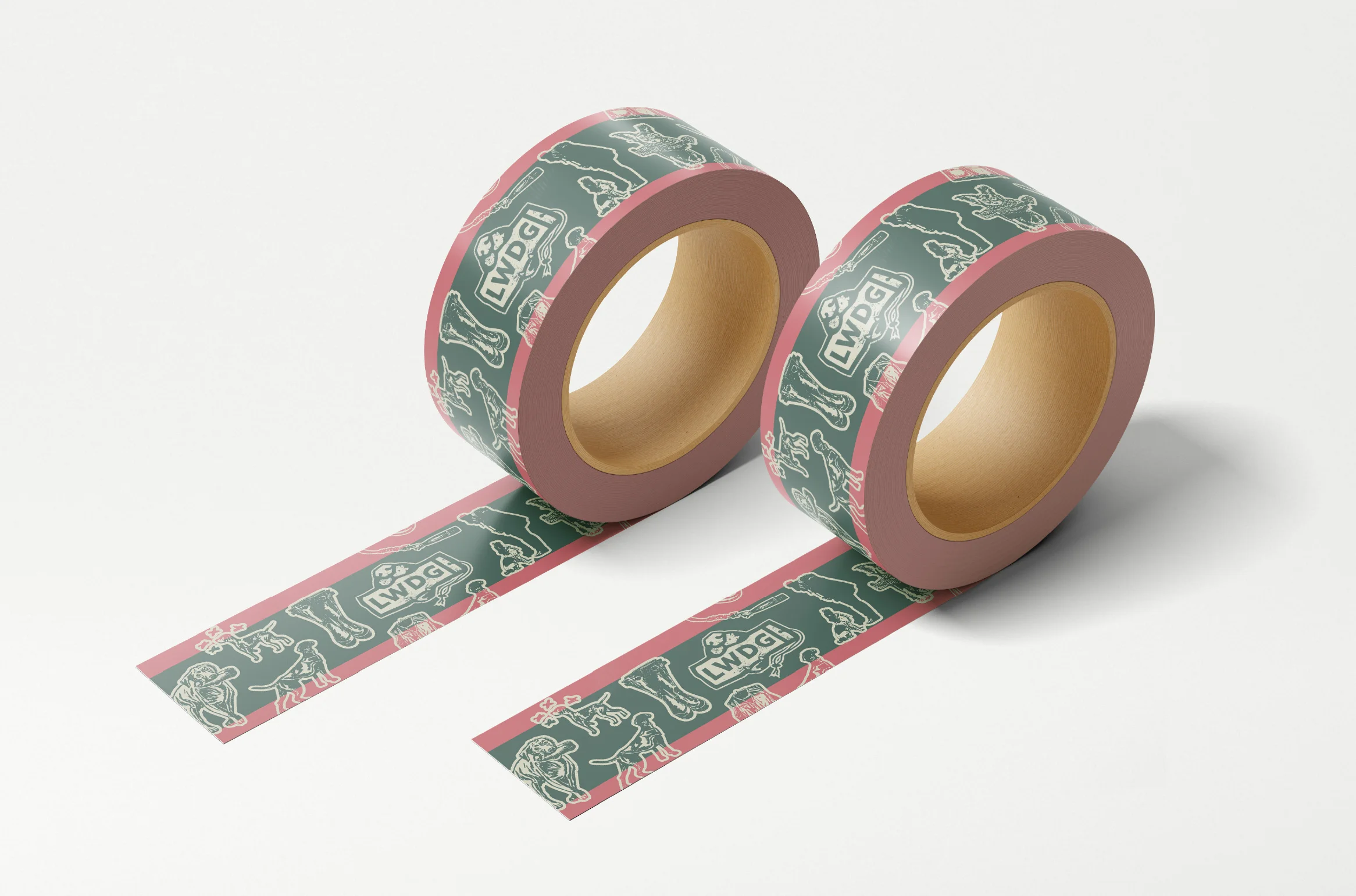
It works as a main badge, but also breaks down into smaller marks that can be used across social media, training materials and member resources.
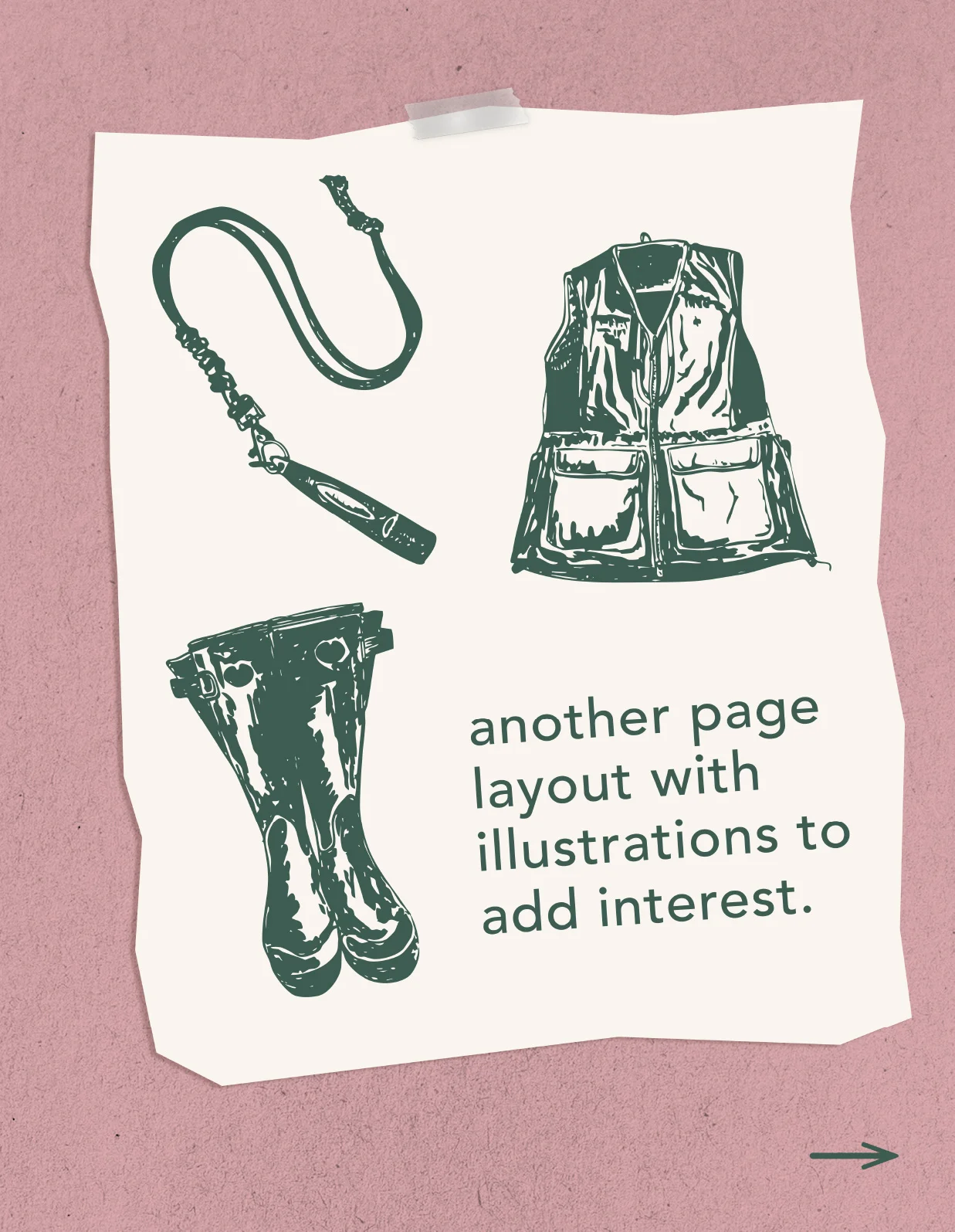
Alongside the logo, we built out a full visual toolkit. Illustrations, layouts, textures and graphic elements that give Joanne the flexibility to create consistent content without reinventing the wheel each time.
What happened next
Jo’s reaction when she first saw the brand was brilliant.
“Oh my god you are a bloody legend!”
But what matters more is what happened afterwards.
Since the branding project we’ve worked together on a whole range of additional pieces for the LWDG community.
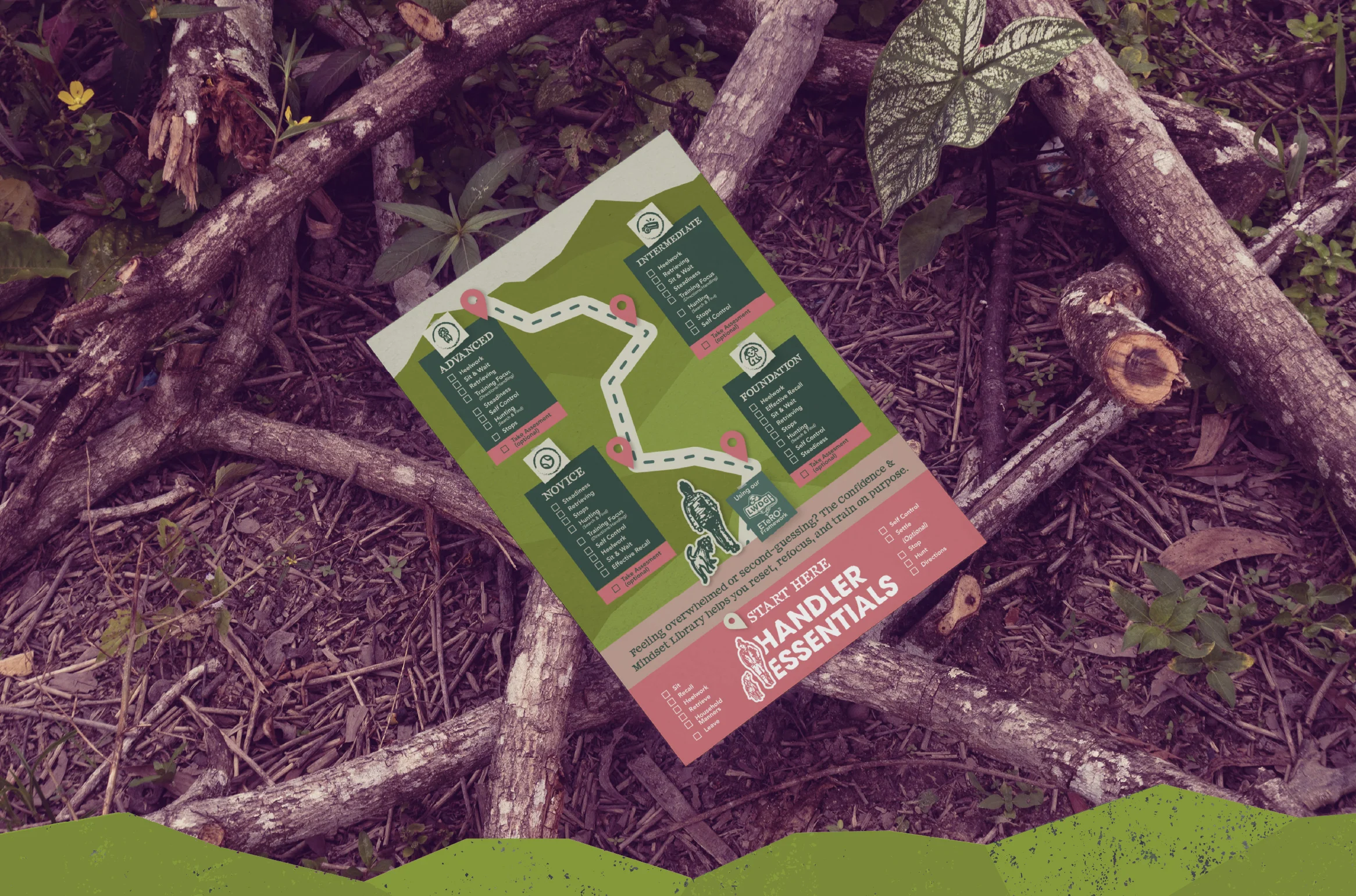
Her members’ training planner, the Magic Month planner, training breakdown guides and a full training pathway graphic that helps members see the bigger picture.
We’ve also created Instagram ads, carousels, additional illustrations and edited a library of her photos to keep that nostalgic countryside style consistent, using custom Photoshop filters built specifically for the brand.
The biggest shift Jo noticed wasn’t just how things looked. It was how much easier everything became.
Because she now had a full set of brand elements ready to go, she stopped disappearing down design rabbit holes trying to make things from scratch.
Instead she could focus on teaching.
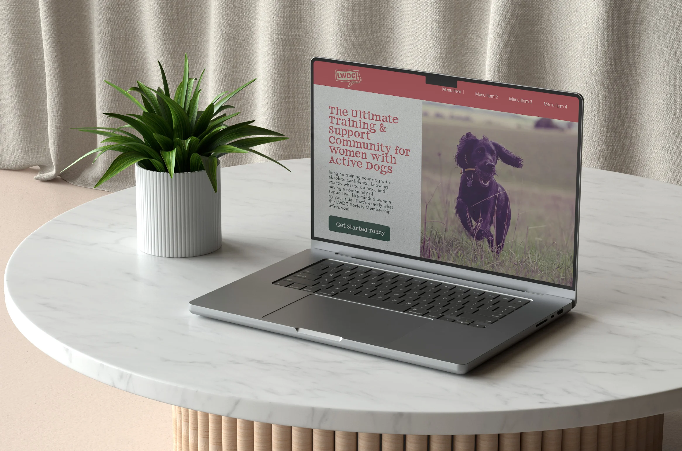
Using the brand toolkit she rebuilt her members’ dashboard, refreshed her website and now keeps her social content consistent across the board.
In her words, it saved her a huge amount of time and stopped her going off on tangents whenever she needed new content.
A brand that feels like the field
The finished identity captures the spirit of LWDG perfectly.
Outdoorsy and grounded. A little nostalgic. A little scrappy. Warm and welcoming rather than polished or corporate.
Just like the community itself.
Because the Ladies Working Dog Group isn’t about being the most perfect handler in the field.
It’s about women and their dogs learning together, supporting each other and enjoying the journey along the way.
“Oh my god you bloody legend!.”
Joanne perrot- Founder – The Ladies Working Dog Group